 Being 2013 and all, I was really hoping that television producers would have got over their fascination with applying a tilt-shift “miniturization” effect to their programming. Alas no.
Channel 4 is the worst offender. Not a show goes by that doesn’t employ the effect. Why? What visual or narrative improvement am I getting?
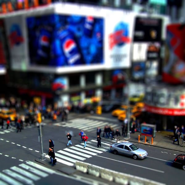
It’s not a new technique, and its early days tilt-shift was sparingly applied for narrative purpose; perhaps to show the perspective of a child or to show control over disorder. Today Kirstie and Phil use it to sell a 1930’s 3-bed semi in Crawley.
The problem is, creating the effect used to involve skill. Now it’s an app.
And if it’s not tilt-shift, it’s some Instagram-like filter deployed to make everything on my expensive HD TV look like it was shot on Super 8 in the 1970s.
The artistic merit of both techniques has sadly been destroyed through over-use. Just like fonts have a personality and purpose, so too should visual effects. I’m sorry, but tilt-shift (and Instagram for that matter) –have become the modern-day equivalent of using Comic Sans.

Leave a comment